Colour Schemes for Your Gallery Wall
Are you looking to spruce up your wall with some fresh and vibrant wall paint colour? Look no further, as we have the perfect solution for you – a gallery wall with wall painting design! A statement piece that can transform any room into a work of art. But before you start hanging up your favorite paintings and photographs, it’s important to consider the overall color scheme of your gallery wall. Keeping a cohesive color palette will not only enhance the aesthetic appeal but also create a harmonious and balanced look. So, let’s explore some tips on choosing the perfect colour schemes for your gallery wall.
| IN THIS ARTICLE |
Monochromatic Elegance
For those seeking a modern and sophisticated look, a monochromatic wall paint colour scheme can work wonders. This involves using varying shades, tones, and tints of a single colour. The simplicity of this scheme allows your artwork to truly shine and make a statement. Imagine a charcoal grey wallpaint colouradorned with black and white photographs, or a pastel pink wallshowcasing artwork in various shades of blush and rose. This style exudes elegance and creates visual harmony, allowing your gallery wall to blend seamlessly with your interior decor.
Bold and Vibrant
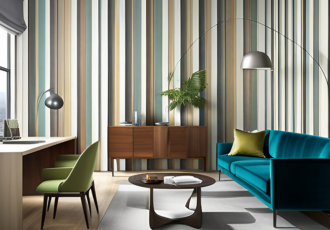
For the audacious and the adventurous, a bold and vibrant colour scheme can turn your gallery wall into a captivating focal point. These schemes involve the use of bright, saturated colours that exude energy and liveliness. Picture a sunflower yellow wall paint colourserving as the backdrop for your vibrant artwork, or an electric blue wall accentuating the colours in your eclectic mix of photographs and prints. Remember, the key is to balance these bold colours with some neutral elements to avoid overwhelming the space.
Soft Pastels
For those who appreciate subtlety and sophistication, a soft pastel colour scheme can create a serene and calming atmosphere for your gallery wall. Soft pastels, with their muted tones and soothing hues, lend themselves beautifully to a tranquil and inviting environment. Imagine a soft lavender wall, complemented by artwork in shades of lilac and periwinkle. Or perhaps a soothing sea-green wall, adorned with prints and photographs in various shades of mint and turquoise. The beauty of this scheme lies in its ability to create a peaceful ambiance, making your gallery wall a refuge of tranquility amidst the hustle and bustle of daily life.
Neutrals and Earth Tones
Embrace the elegance of simplicity with neutrals and earth tones for your gallery wall. This color scheme, known for its versatility and timeless appeal, brings a sense of warmth and natural harmony to your space. Imagine a taupe or beige wall, serving as a subtle backdrop for your cherished collection of sepia-toned photographs, vintage prints, or rustic artwork. Or, consider the profound depth of a rich chocolate brown wall, enhancing the earthy hues in your collection of house painting. The neutral and earth tone scheme is the ultimate choice for those seeking a sophisticated yet understated aesthetic.
Complementary Contrasts
There is no denying the allure of complementary contrasts when it comes to creating a visually stunning gallery wall. This colour scheme involves pairing colours that exist on opposite ends of the colour wheel, creating a vibrant yet balanced look that immediately grabs attention. Imagine an eggplant purple wall serving as the backdrop for artwork and photographs in shades of sunny yellow. Or perhaps a striking red wall, contrasted with prints and illustrations in shades of sea green.
In conclusion, your choice of color scheme can dramatically transform your wall painting design, turning a simple collection of artworks into a stunning visual house painting. Whether you prefer the elegance of monochromatic tones, the bold drama of vibrant hues, the serene tranquility of soft pastels, the timeless appeal of neutrals and earth tones, or the dynamic excitement of complementary contrasts, there’s a color scheme out there that perfectly matches your style and personality.